Background videos, and videos that autoplay on websites are becoming more and more popular (and perhaps will soon be the new normal). It is also common to only display the video on larger screens, and to hide the video on small screens.
An Anti-pattern emerges
However, in my experience of looking at hundreds of websites on mobile and desktop – I see that many sites that do not show the video on mobile devices simply use CSS to “display:none” the videos on mobile.
Great – no video appears on the screen! But, if you happen to open devTools, or run WebPageTest on a mobile sized screen, a horrible secret emerges:
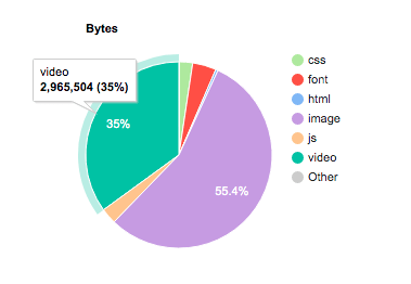
The background video is not displayed to the user, but every mobile user is downloading a significant bit of the video (in the screenshot above – nearly 3 MB of unseen, unused video!) So what’s going on here? Let’s look at the HTML:
<video id = "hero-video"
       playsinline
       autoplay
       muted
       loop
       poster="poster.jpg" >
  <source src="video.mp4" type="video/mp4">
</video>
So the video is set to autoplay, and is muted (for autoplay on mobile), but the video is hidden due to the CSS:
	@media only screen and (max-width: 992px) {
		#hero-video { display: none; }   /*. hide video on mobile screens*/
		#mobile-hero-image {display: inline-block;}
	}
	@media (min-width: 993px){
		#hero-video {display: inline-block; }
		#mobile-hero-image {display: none;}
	}
On screens smaller than 992px (my arbitrary cutoff), the video is replaced by an image placeholder. On bigger screens – the opposite. Curious? Here’s an example page and Mobile Chrome WebPageTest results.
This is a Problem
Mobile users are often on a constrained network or have a limited data plan (or both!).
Knowing that the one video file on your site could easily double or triple the weight of your page, and knowing that your mobile customers will never see it – we should do something to prevent this extra download from happening.
The Fix!
There are 2 changes to the video tag:
- We’re going to remove the autoplay attribute from the video tag. Don’t worry, we’ll use JavaScript to insert autoplay for larger screens.
- Add “preload=none” . This tells the browser to not download ANY of the video until it needs the file.
With no autoplay, and preload=”none”, mobile devices will not download any video at all. So our code looks something like this:
<video id = "hero-video"
             preload = "none"
             playsinline
             muted
             loop
             poster="poster.jpg" >
<source src="video.mp4" type="video/mp4">
</video>
Now, to re-add the autoplay command, we simply use JavaScript to add the attribute back if the window is over our 500px threshold:
<script>
	window.onload = addAutoplay();
	var videoLocation  = document.getElementById("hero-video");
	function addAutoplay() {
		if(window.innerWidth >992){
			videoLocation.setAttribute("autoplay","");
	  };
	}
</script>
Now, on page load, the autoplay attribute is added to “large” screens. The autoplay attribute is of higher importance than preload=”none” and so the video will begin to immediately download and playback – just like it does today.
On mobile devices, there is no autoplay, and the preload=”none” prevents the browser from downloading the video. There is a test page, and the WebPageTest results for mobile Chrome show no video download occurs.
Other approaches
Instead of adding the autoplay to “larger screens” you could do the opposite: remove autoplay from the smaller screens.
		if(window.innerWidth <992){
			videoLocation.removeAttribute("autoplay");
	        };
Another approach is to only add the video source to screens that can play the video. I like this approach as it gives you the opportunity to create several videos – perhaps a smaller 720p video for larger smartphones, and a 1080p (or larger) video for desktops.
<script>
var videoLocation = document.getElementById(“hero-video”);
window.onload = videoSource(videoLocation, “video.mp4”);
function videoSource(element, src) {
if(window.innerWidth >992){
var source = document.createElement(‘source’);
source.src = src;
videoLocation.appendChild(source);
};
}
</script>
Conclusion
Hiding video from mobile devices does not prevent the video from partially downloading – wasting megabytes of data on each page load (and potentially GB and TB from your servers!). As developers, we should take the extra steps to prevent this data waste, and by programmatically adding the autoplay parameter based on the screen size of the device, we are able to eliminate video downloads on mobile devices that never show the video.
Test your site with WebPageTest or your favourite devTools to see if your mobile users are forced to download videos that they can never see, and then stop it from happening!
 SpeakOfTheDevrel.Cloud: Doug Sillars
Hi there. This approach worked for me on all browsers except for IOS devices. The video simply would not play. Any ideas? Thanks for sharing you knowledge!
LikeLike
Do you have ‘playsinline’ added?
LikeLike
Yes I do. Im using jQuery however with a document ready statement. Do you think that could have any effect? Also, the video on IOS gets the proper attributes but it just doesnt autoplay.
LikeLike
I think Its an issue with IOS 15. Works fine on IOS 14.5
LikeLike